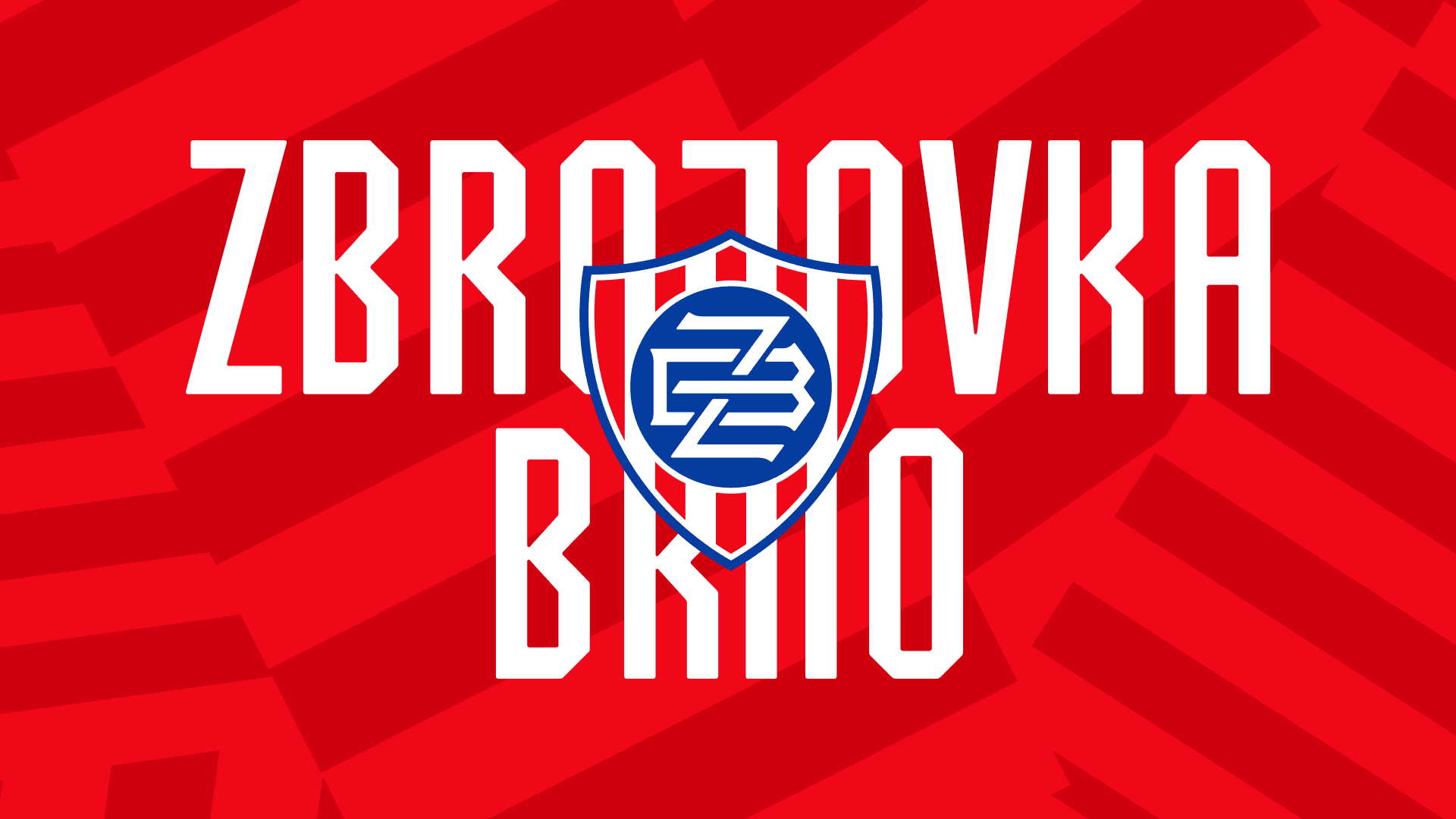
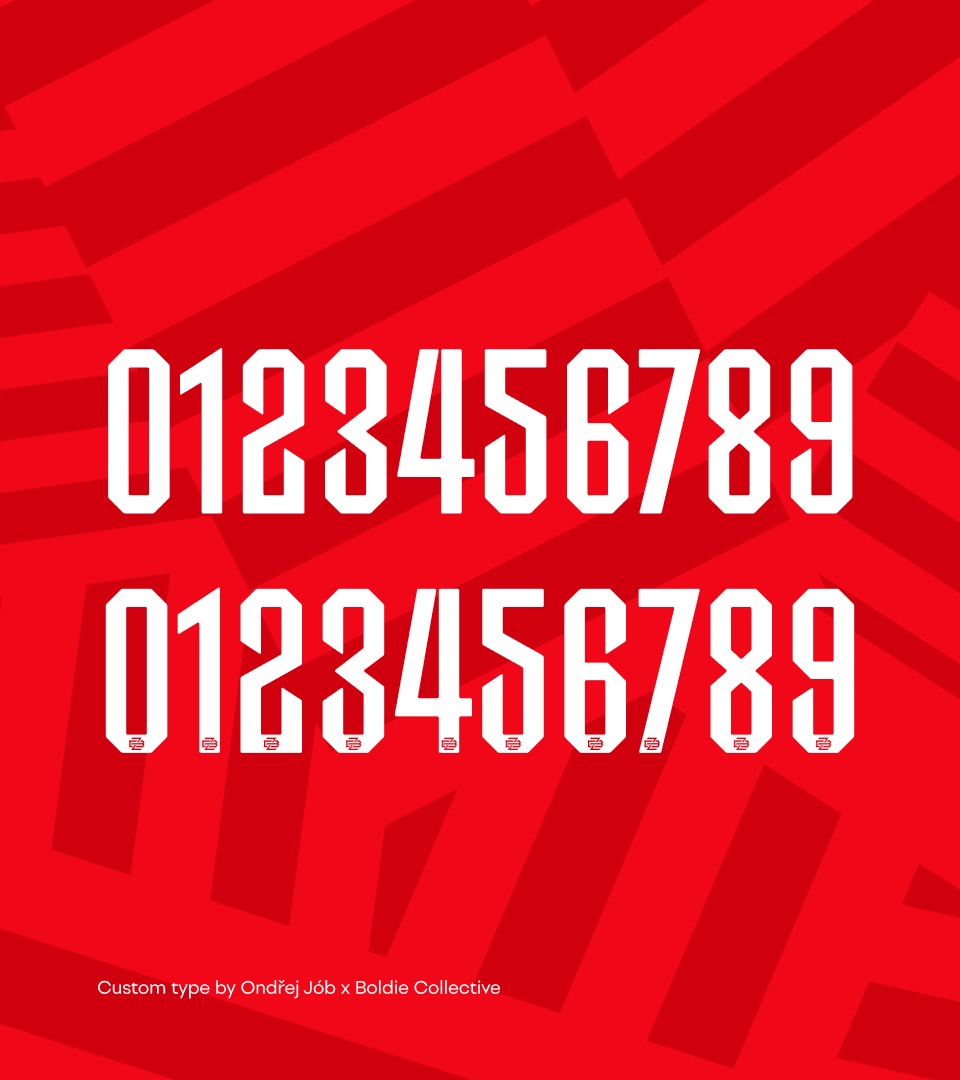
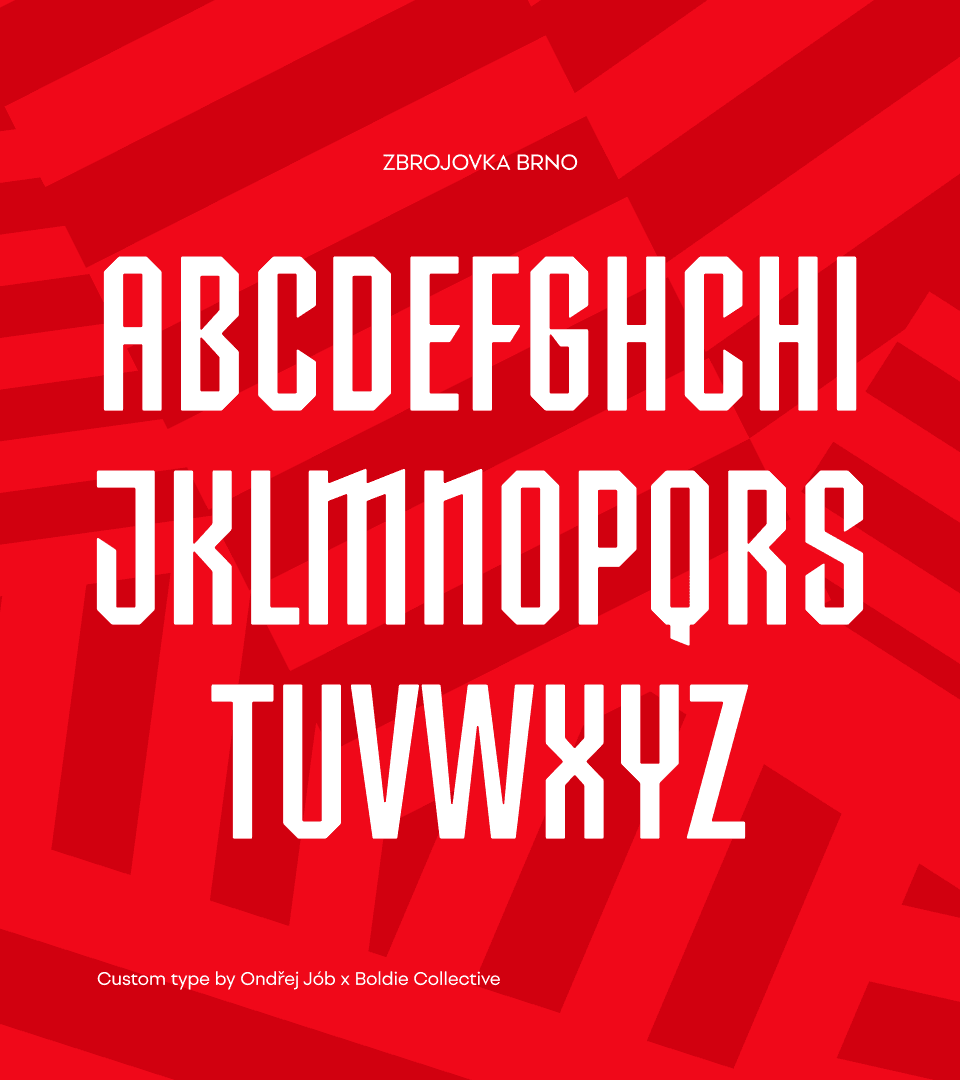
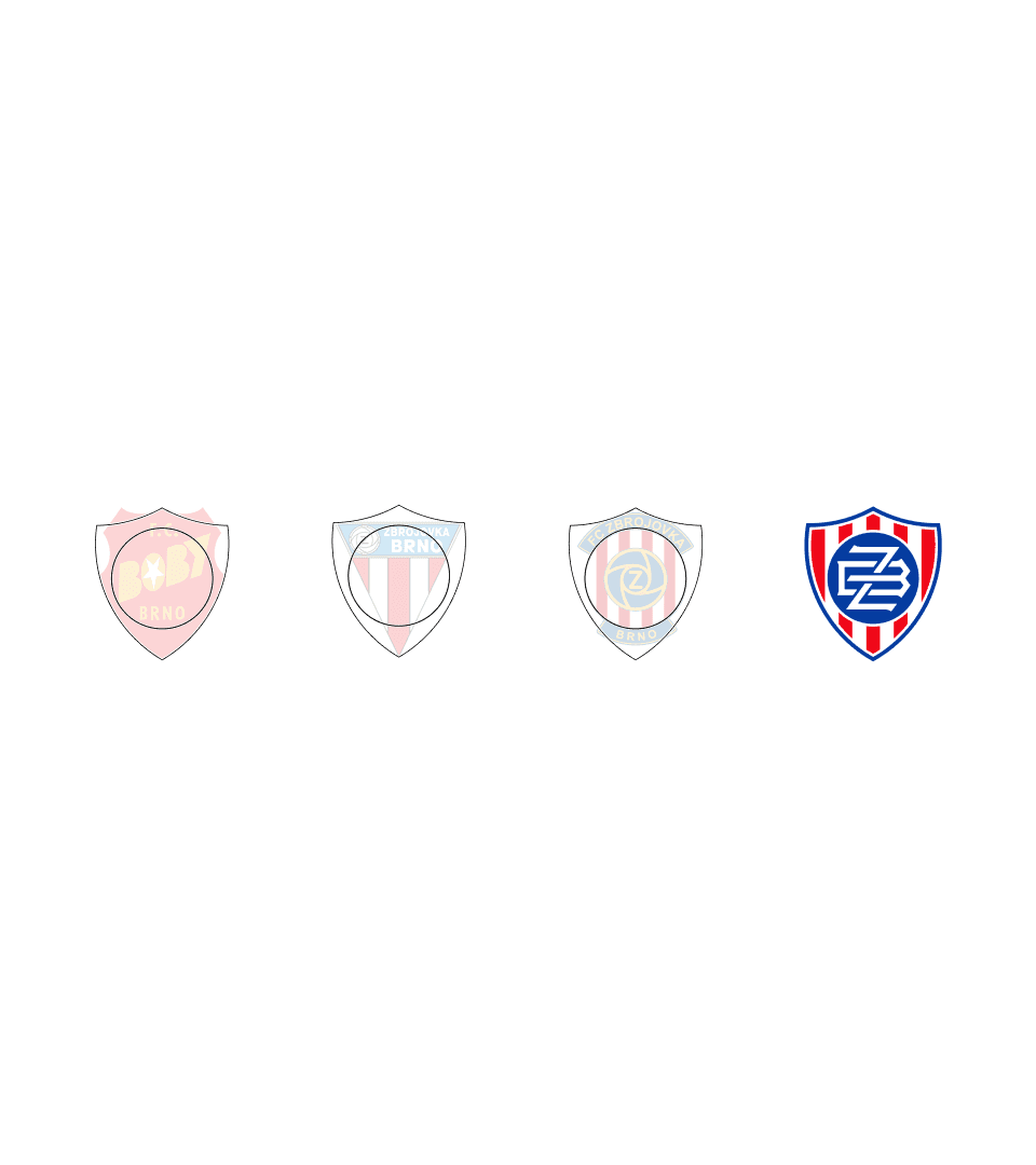
FC Zbrojovka Brno is built on a strong connection to Moravia and its supporters. The new visual identity translates this foundation into a shield-shaped monogram inspired by Moravian symbolism, combining strength, function, and a contemporary design approach. Designed to work without the club name, the mark is simple, distinctive, and adaptable across all touchpoints. Beyond the logo, the project introduced a broader identity system for the club’s next chapter, including custom typography developed with Ondrej Jób, a dragon symbol inspired by the idea of awakening football in Brno, and the Flinta platform connecting fan experiences across digital and physical touchpoints. Together, these elements create a flexible framework designed to support the club’s future growth client: FC Zbrojovka Brno
Client
FC Zbrojovka Brno
Year
2026
Deliverable
Strategy, Brand Identity, Merch, Club Mascot, Execution


Info
FC Zbrojovka Brno is built on a strong connection to Moravia and its supporters. The new visual identity translates this foundation into a shield-shaped monogram inspired by Moravian symbolism, combining strength, function, and a modern approach. Designed to be simple, distinctive, and scalable, it works across all touchpoints.
Credit
Creative and Strategy Director: Zdeněk Šemro
Typography: Ondrej Jób
Art Director: Jan Pekárek
Graphic Designer: Pavel Štutzbart
Strategist: Filip Janouch
Motion: Igor Pašek
Video: Filip Kocián
Photo: Patrik Palacký a Marek Kocák
Account Director: Kristýna Lugmajerová
Account Manager: Klára Friedrichová